Isi T Easy to Change and Amtrak Reservation

Amtrak — greatest ride in the US — has had a reliable train reservation system for years. Recently, however, it was redesigned and following the smart-to-stupid software development cycle, enhancements were put into the system to make it frustratingly harder to make a reservation. Frustrating to the point where I spent 30 minutes trying to make a reservation that should have taken 5 minutes.
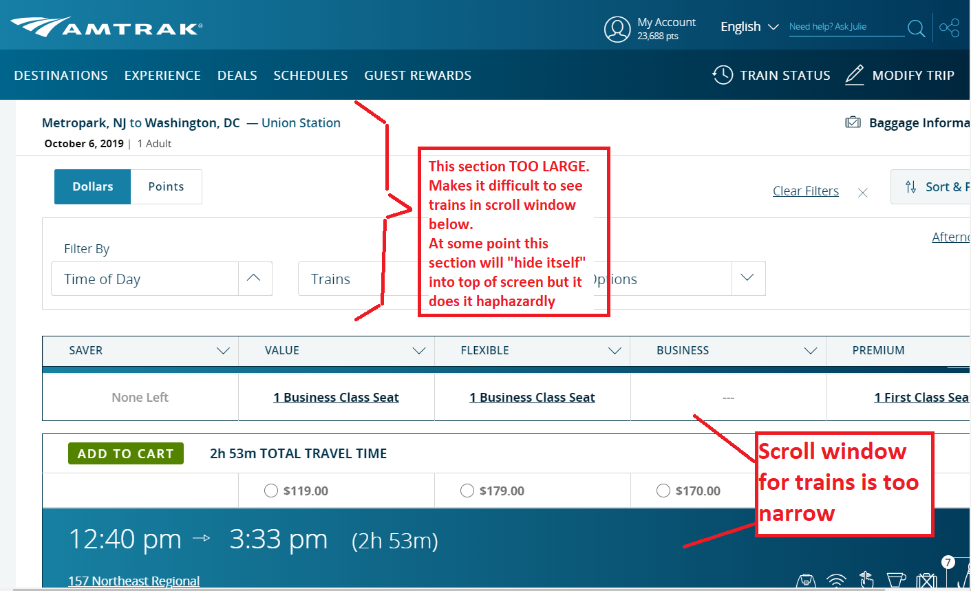
Problem #1 — Scroll Window for Trains is Too Small
The scroll window for available trains has been made too small. You can only see one train at a time and it is difficult to see if you are seeing the prices for that train or the one above it. The scroll windows has had its size decreased because the top of the page has gotten bigger (see below). This top filter section is designed to hide itself — folding itself into the top of the page — but this happens haphazardly, especially in a Chrome browser where it sits there most of the time. In Firefox the spacing seems better.

Problem #2 — Do Not Appear Allowed to Pay by Credit Card Without Adding Credit Card to Amtrak System
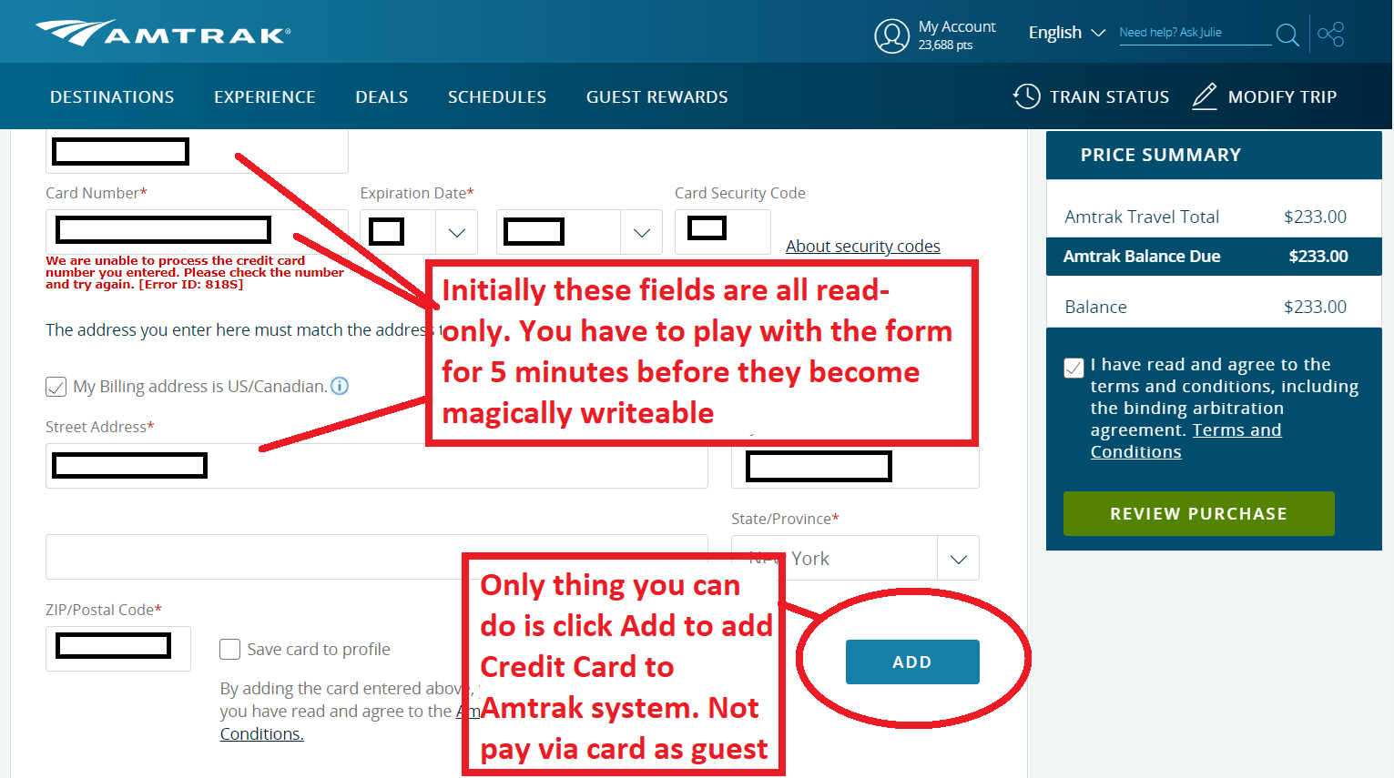
On the pay screen you have three choices — Pay by Credit Card, Pay with Points, or Pay by Voucher. However, on the Pay by Credit Card section — you must click an ADD button which seems to say you are adding your Credit Card information to the Amtrak System — which some people do not want to do in case the Amtrak system gets hacked — you just want to CHECK OUT with credit card.
However, you MUST hit the ADD button to check out via Credit Card. This seems to be a misleading choice of words for the button because after navigating the system for many minutes to find an option where I didn't have to add my credit card to the Amtrak system — I finally clicked Add and was able to check out. I later looked and found my credit card had not been added to the Amtrak system — so — bad choice of words.

Problem #3 — In Chrome the Credit Card Field is Unwriteable at First
In Chrome I could not add my credit card information — it seemed writeable but wasn't. I finagled thru the page clicking Add and other choices until finally after 5 minutes the credit card field became writeable and I was able to add my credit card information.
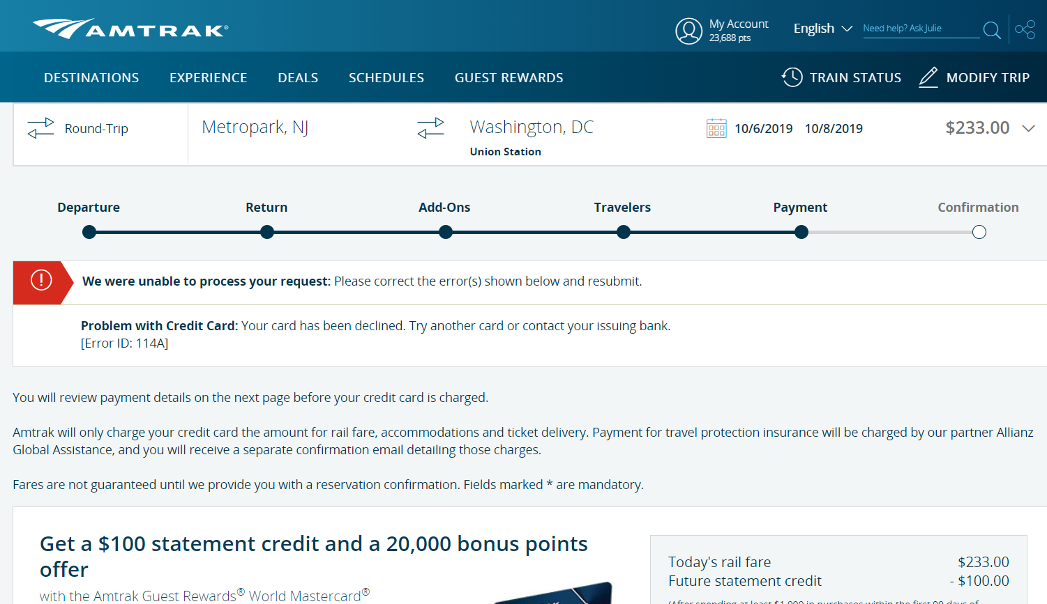
Problems #4 and #5 — In Chrome a Valid Credit Card Was Rejected; Inconspicuous "Unsuccessful Reservation" Page
After all of the above, I clicked Add and then Review Purchase and the reservation seemed to take. I was about to close my screen. Then luckily I read the fine print of the next screen and it said there was a problem with my credit card and the reservation had not been made. So two problems — that message should have popped up to me BLARING on the screen — not be hidden in the text of the next seemingly successful reservation page. There is a red arrow — but it is easily missed. Other than the red arrow the page looks like a normal Amtrak page. It would be much less dangerous if you popped up a message on the screen that said Reservation Not Made Credit Card Bad — and did not allow the person to proceed until they clicked OK to the message. Bottom line: I almost walked away thinking I had a reservation, when I didn't. I'm sure you may get this from many customers causing your tech support lines grief.
Second issue — I went to Firefox and did all of the above, and made the reservation — the same credit card was fine. So the credit card info is not being processed correctly in Chrome.

To Amtrak Twitter:
I am sending this report to the folks at Amtrak who not only offer a FANTASTIC train system but also have one of the BEST twitter accounts amongst corporations on the internet — always very responsive and helpful.
grangeonswevarned.blogspot.com
Source: https://ignoranttraveler.com/issues-with-new-amtrak-reservation-system/
0 Response to "Isi T Easy to Change and Amtrak Reservation"
Post a Comment